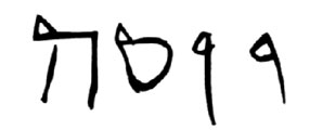
The blogosphere has yet again been in quite good form with lots of folks demonstrating the numerous problems with the latest claims about the presence of the name “Yonah” (Jonah) etched in the supposed stick-man at the bottom of the vessel fish at the center of the discussion of the Talpiot Tomb B ossuaries. Bob Cargill and Mark Goodacre have persuasively shown that the lines of the supposed “nun” do not in fact connect, a problem for regarding these etchings as one letter, and Cargill has compiled a list of problems with each of the first three letters. To this, I will add one other problem I have yet to see mentioned: fourth letter, the supposed ה (hey) at the end of the supposed name features two lines that should not be connected in the way they are if this were actually that letter. If this were actually an Aramaic/Hebrew block letter, it looks as though it would be better taken as a ח (het), as both vertical strokes of that letter connect with the top but without any serif or line sticking above the horizontal stroke on the right side, as we see here. (Actually, it may look like the Greek letter π (pi), but that can’t fit with a Jonah interpretation, so nobody has suggested that yet.)
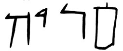
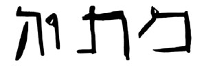
We have examples of the letter ה in inscriptions from Talpiot Tomb A, which would be our best analogues for an alleged inscription 200 feet away in roughly the same time period. I’ll let you be the judge on whether the morphology looks similar enough to say that this is really a ה and not something else (HT for pictures):
(Mattiyah; Rahmani 703)
From another ossuary, CJ02:


Yoseh (Rahmani 705)

Maria (Rahmani 706)
Only in the very last one do we have connection between the left vertical and the horizontal stroke, and in that one, we have a clearly defined right vertical stroke that passes the above the plane of the horizontal stroke producing a small “serif” and preserving the difference between the right and left vertical strokes. Keeping all these examples in mind, let’s take another look at the supposed ה in the supposed “Yonah”:


5 Comments. Leave new
Aye there are many problems with the inscription as a whole, but the “He” certainly is curious.
Where it is very common in Herodian script for the He’s left descending stroke to be connected (in fact that’s how I write it, myself), generally there is a serif or the right stroke extends slightly over the top stroke as you can see in Rahmani 706 and (despite being unconnected) it’s also present on CJ02.
Also, if one takes into account the line to the bottom-left of the left downward stroke, one could interpret this as a possible Taw, but then it’s a matter of “you come to a fork in the road, which way to do you choose?” 🙂
In any case, good points. 🙂 It’s a mess of lines and I’ll probably do one more article on my own blog about this particular letter rather soon.
Peace,
-Steve
Thanks for the comment, Steve. I 100% agree—the lack of the serif or right stroke extending over the top stroke is what is really unusual in Herodian script. If it’s connected on the left, I’d expect a different right vertical stroke.
[…] so you can find various sites which show pictures of the inscription. Here and here and here, for […]
[…] claim that the name “Jonah” is actually scribbled into that area (addressed here and here), with some of the lines of the name also functioning as part of the stick […]
[…] claim that the name “Jonah” is actually scribbled into that area (addressed here and here), with some of the lines of the name also functioning as part of the stick […]